All of Us

The NIH’s massive data collection initiative All of Us allows researchers access to data from multiple institutions.

If you’ve ever envisioned a project only to find out that UAB doesn’t have sufficient numbers for the statistical power you’re after, it may be worth checking out the researcher workbench in All of Us.

While large parts of the workbench are designed with Data Scientists and Statisticians in mind, there are some key parts that don’t require knowledge of a coding language or the construction of database queries. Here I outline two of them.

The Data Browser

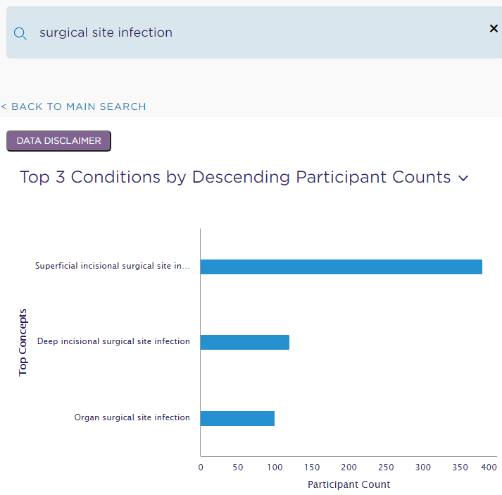
Even without an Alll of Us researcher account, you can search for a condition (e.g., Surgical Site Infection) or measurement (e.g., metabolic panel) and immediately be presented with the number of All of Us patient participants matching your search. For example, search for “surgical site infection” found 600 participants with a condition matching my search (see breakdown below).
Similarly, a search for “metabolic panel” found 7 matching lab measurements across about 45,000 participants.

These high level counts are available on the public portion of the website. So, you can find out if there’s a sufficient sample size to warrant applying for access to the researcher workbench and applying for IRB approvals and waivers as necessary.

One other handy tool in the Data Browser are the “matching concepts.” Here are the top 3 matching concepts that were returned in my search for “metabolic panel.”
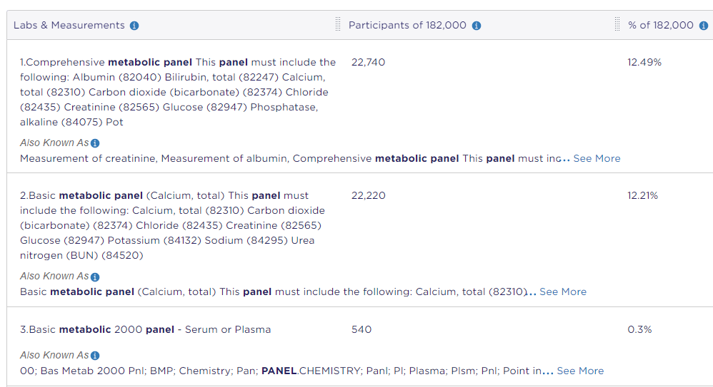
These can be helpful when requesting data either from our internal Anesthesiology and Perioperative Medicine IT team or HSIS. You can potentially skip the part where the data person is confused about what you mean by first searching in the All of Us data browser and including the matching concepts that fit what you’re looking for. I myself have done some of this with our internal IT team, so I know it can be a time saver.

For more information on the All of Us researcher workbench, check out their publicly available description and videos: Researcher Workbench – All of Us Research Hub (researchallofus.org).

The Cohort and Dataset Builders

Sadly, I don’t feel comfortable giving screenshots here because of some of the researcher agreements that apply to All of Us. However, once you have an All of Us researcher account (and the appropriate IRB and regulatory approvals, if applicable), you can assemble a Cohort of All of US participants through the Cohort Builder and access their collected EHR data through the Data Set Builder. If you do those steps, you’ll probably be at a place where you want the help of a Data Scientist or Statistician. But, you can arrive at your first meeting with them with data in hand. Talk about speeding up a project!

i2b2

Internally, UAB has a similar initiative called “i2b2.” It can provide information about potential sample size (and statistical power) for projects you may envision. I’ll cover some of the useful bits of i2b2 in a future post. Stay tuned!

Perioperative Data Science: 2020 and beyond

Artificial intelligence and machine learning (AI/ML) are seemingly everywhere. The expansion into medicine began with radiology, expanding more recently into perioperative medicine. Between 2016 and 2020, the FDA approved 26 algorithms with perioperative utility. Last year, our department joined the charge!

Dr. Melvin is working with clinician-researchers and IT to build a Perioperative Risk Platform. This platform will synthesize massive amounts of data into actionable (personalized medicine) predictions. Our IT group’s decade-long work on a data platform makes this effort possible. Such predictive models consume data on providers, locations, times, and procedures. See the figure to the right for examples of what the resulting predictions might look.

Small, specific models will make up this larger platform. This work is underway. We are testing a model for predicting Opioid-Induced Respiratory depression using historic data. A model for ICU length of stay is undergoing refinement as part of a cross-site collaboration. This model holds promise for bed management and staffing optimization. We are implementing a model using real-time data for determining lower limit of cerebral autoregulation. Post-PACU MET call, Surgical Site Infection, kidney injury, and patient decline projects are ramping up. These and other ongoing data science projects involve collaborations from across the department.

In collaboration with Radiology, we are developing a clinician-focused vocabulary for AI. This vocabulary will speed communication and prevent misunderstanding of appropriate model use. Our hope is to be the architects of AI language for the medical field at large. We are also learning from Radiology’s inaugural AI bootcamp for residents from Q4 of 2020. Additionally, our department is planning a STAR program curriculum for machine learning.

The latter half of 2020 saw the initiation and ramping up of several data science projects. This year will see even more new projects and completion of many already underway. Check back on this blog for monthly updates.

Machine Learning or Statistics?

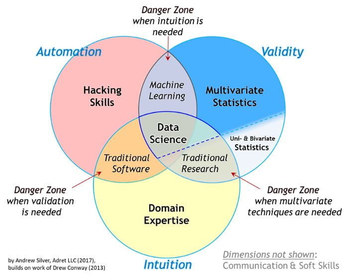
A Venn diagram made the internet rounds a few years ago trying to explain the overlaps of machine learning, statistics, programming, and data science. Source: https://towardsdatascience.com/the-essential-data-science-venn-diagram-35800c3bef40

Machine learning and statistics both have procedures for making predictions and exploring relationships. Trying to explain the differences in the two often feels like debating semantics. However, there are some practical differences that can often prove frustrating to those encountering them for the first time. Here I try to concretely differentiate the types of questions that each field is better at answering.

Machine learning tends to do better at predicting future values (with some notable exceptions when it comes to medical data [1]). In a practical sense, machine learning models sacrifice interpretability for predictive accuracy. For example, a machine learning model could predict what a patient’s glucose level will be a few hours from now [2], monitor for cardiac arrhythmia’s in real time [3], use a patient’s own baseline data to determine abnormal vital signs [4], recommend insulin doses [5], and so on. However, if you ask for an explanation of how the model arrived at a prediction or recommendation, a cold black box will stare back unblinkingly with no answer. Machine learning is typically best for predictions, but it tends to be bad for explaining the relationships in data.

XKCD “Machine Learning” panel. Used under creative commons license CC BY-NC 2.5.

Statistics tends to do better at detecting relationships in data and quantifying the significance of those relationships. So, if you want to show an intervention caused a significant change in patient outcomes, that’s a statistics question. If you want to know if your new score card accurately predicts sepsis, that’s a statistics question. If you want to show that a policy change resulted in different outcomes over time, that’s a statistics question. Hypothesis testing is the realm of statistics. Often these hypotheses and detected relationships imply predictions of future values (e.g., logistic regression), but statistical models prioritize interpretable relationships over predictive accuracy.

Next, let’s consider a few examples where the distinction is subtle. Suppose you’ve come up with a new index for predicting hyperglycemia. Testing whether the index performs well is a job for statistics. However, if you want to develop a new index from scratch, machine learning can help out.

Maybe you have five factors that you know lead to respiratory distress after surgery. If you want to know how much each of those factors influences the outcome, your project is best served by statistics. However, if you want the most accurate prediction of the outcome possible without needing to know the influence of each factor, that goal is in the realm of machine learning.

If you find yourself asking how multiple pieces of data relate to one another, statistics is the tool for you. However, if you are looking for predictions of an outcome and don’t need to know detailed reasons for the predictions, that’s a job for machine learning.

References

[1] Christodoulou, E., Ma, J., Collins, G. S., Steyerberg, E. W., Verbakel, J. Y., & Van Calster, B. (2019). A systematic review shows no performance benefit of machine learning over logistic regression for clinical prediction models. Journal of Clinical Epidemiology, 110, 12–22. https://doi.org/10.1016/j.jclinepi.2019.02.004

[2] Abraham, S. B., Arunachalam, S., Zhong, A., Agrawal, P., Cohen, O., & McMahon, C. M. (2019). Improved Real-World Glycemic Control With Continuous Glucose Monitoring System Predictive Alerts. Journal of Diabetes Science and Technology. https://doi.org/10.1177/1932296819859334

[3] Rajput, K. S., Wibowo, S., Hao, C., & Majmudar, M. (2019). On Arrhythmia Detection by Deep Learning and Multidimensional Representation. 2. http://arxiv.org/abs/1904.00138

[4] Stehlik, J., Schmalfuss, C., Bozkurt, B., Nativi-Nicolau, J., Wohlfahrt, P., Wegerich, S., Rose, K., Ray, R., Schofield, R., Deswal, A., Sekaric, J., Anand, S., Richards, D., Hanson, H., Pipke, M., & Pham, M. (2020). Continuous wearable monitoring analytics predict heart failure hospitalization: The link-hf multicenter study. Circulation: Heart Failure, March, 1–10. https://doi.org/10.1161/CIRCHEARTFAILURE.119.006513

[5] Nimri, R., Oron, T., Muller, I., Kraljevic, I., Alonso, M. M., Keskinen, P., Milicic, T., Oren, A., Christoforidis, A., den Brinker, M., Bozzetto, L., Bolla, A. M., Krcma, M., Rabini, R. A., Tabba, S., Smith, L., Vazeou, A., Maltoni, G., Giani, E., … Phillip, M. (2020). Adjustment of Insulin Pump Settings in Type 1 Diabetes Management: Advisor Pro Device Compared to Physicians’ Recommendations. Journal of Diabetes Science and Technology. https://doi.org/10.1177/1932296820965561

An in-progress survey of FDA-approved algorithms in perioperative medicine

I am currently working on a review of all FDA-approved Artificial Intelligence/ Machine Learning (AI/ML) algorithms in the perioperative space. The goals of this article-in-progress are to

  • assess current state of AI in perioperative medicine,
  • develop a user-friendly vocabulary for describing and categorizing algorithms, and
  • apply the developed vocabulary to FDA-approved algorithms with perioperative utility and a primary citation.

I am seeking collaborators in our department. The parts I need help with are structured, which I think makes this project a great opportunity for those early on in their research career.

Presently, I have found an online database with 70 FDA-approved algorithms that make some mention of AI/ML in either their approval or marketing materials. Of those, 26 seem to have perioperative utility, and of those 26, 17 have a primary citation I can locate.

The pieces I need help with are

  • reviewing my assessments of perioperative utility from a clinical perspective.
  • discussing the categories this paper establishes and which algorithms should go in each category.
  • Trying to find a primary citation for the 9 algorithms I could not locate.

If you are a UAB Department of Anesthesiology and Perioperative Medicine clinical faculty member and you’ve been looking for an AI/ML research project to collaborate on, please reach out to me using this form or by finding my email in Outlook.

Building the Layer Cake: A quick-value approach to AI and machine learning

For every truck in their fleet, UPS currently recalculates the best route after every single package is delivered. So, if you and your neighbor are both getting a package, in the time in takes to deliver them, UPS has determined the optimal route for all remaining packages on the truck … twice! This is a machine learning feat that required satellite launches, GPS and map experts, network theory, theories of optimization from mathematics, ten years, and hundreds of millions of dollars (see this Harvard Business School article). However, UPS didn’t start with this complex solution when they decided to optimize routes.

The following story I heard at the recent Data Science Connect (virtual) conference a few weeks ago. It contains a powerful lesson for thinking about complex projects.

As it turns out, the first thing UPS did was simply make sure that all the packages on a given, single truck were headed to the same neighborhood (or delivery area). They made a simple, common-sense change that immediately delivered value. Additionally, this change set them up for the eventual big-budget, time-consuming project.

If the packages on a single truck need to go to many different parts of a city, there is a limit to how much route optimization can improve things. It would be like asking, “what’s the best way to pay my bills by driving one penny at a time to each business I owe?” We can figure out an optimal route, but maybe there are some more basic problems to solve here first.

There is a general principle for AI or Big Data projects that we can extract from this story, and to illustrate it, let’s think about cake. I’ve taken this metaphor from Bill Franks’ (Chief Analytics Officer of the International Institute for Analytics) wonderful talk (Franks 2020 — full reference below).

Rainbow Layer Cake clipart. Free download transparent .PNG | Creazilla
Layer Cake. Image used with permission under a Creative Commons CC0 1.0 Universal Public Domain Dedication.

Consider a layer cake. When you decide to make one, you don’t go straight from having no cake to having four layers of cake (Figure above). Rather, you put down the first layer and then proceed to build on top of it with each layer setting up the conditions for the next. First, UPS had to group similar delivery area boxes onto trucks. Then, they had to figure out how to optimize the truck’s route once. Finally, they figured out how to optimize routes in real time.

Notice that each “layer” of the UPS optimization cake needed the layer before it. Deciding what delivery area packages go in what truck set up the success of optimizing routes. Then, it doesn’t make sense to try optimizing a route hundreds of times a day before you try optimizing it once. So, the single-optimization layer sets up the success of the real-time optimization layer.

Additionally, the construction of each layer provided immediate value. Grouping packages was better than not. Optimizing the routes once was better than no optimization. And finally, real-time adjustment is better than single optimization at the start of the day.

This story has informed my thinking. Now when researchers ask me about machine-learning tasks (e.g., predicting X a certain number of minutes before it happens), I think about what the simpler base layers of the cake might look like. I think about what deeper, basic questions we can answer that will provide quick value while setting us up for success on the big (whole layer cake) question.

References

Franks, Bill. (2020, October 7-9). Scaling Data Science & Analytics [Conference presentation]. DSC 2020 Conference. Virtual. https://datasciconnect.com/media/videos/

When has a significant change occurred?

Our department (Anesthesiology and Perioperative Medicine) is constantly engaged in research and quality improvement (QI). Both pillars of the department often involve measuring the change caused by an intervention. For a large swath of such projects, a statistical test (e.g., t-test or chi-squared test) can indicate if there’s a difference between two groups of data. However, if that data has a time component, things can get more complicated.

Through this post, I hope to provide exposure to a segment of statistics called “Interrupted Time Series,” providing enough information for you to have an idea of when it might be an appropriate analysis method for your own work. I’ll avoid the mathematics and deeper details but provide enough details for you to recognize the utility and know what to search for if you’re interested in learning more.

A branch of time series analysis called “interrupted time series” (or “ITS”) helps with quantifying the effects of an intervention. Interrupted time series applies when there is a set of time-bound data before an intervention, a clear time period when an intervention occurs, and a set of time-bound data after the intervention. The core ideas of ITS come from middle school math — slopes and intercepts. ITS is a rigorous way of asking, “Did the slope change after the intervention,” “Did the intercept change after the intervention,” and “Are these changes statistically significant?” Some fields call this method “quasi-experimental study design” or “differences-in-differences”, and the particular charts I show below are all examples of segmented regression — a method within ITS.

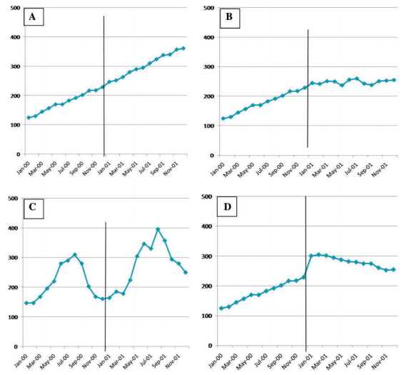
For example, suppose some policy change is intended to reduce the rate of naloxone administrations per month. Before the intervention, we might have number per thousand of patients administered naloxone each month. Our time period of intervention would be when the policy goes into effect. After that date, we would continue to record administrations per thousand each month. To understand why such an experiment requires a special kind of analysis, let’s consider a few potential results in the figure below, where the black vertical line represents the time when the policy went into effect. Note that these plots are completely fake and are (hopefully obviously) exaggerated for effect.

Figure 1 of Lagarde, Mylene. “How to do (or not to do)… Assessing the impact of a policy change with routine longitudinal data.” Health policy and planning 27.1 (2012): 76-83. These are exaggerated examples meant to indicate the need for statistical analysis in time-bound studies of policy impact.

Notice with panel A, a typical two-sample statistical test might tell you that the average before and after the intervention are different. Even worse, you might conclude your intervention had the opposite effect intended, since the average after is larger than before. However, ITS would tell you that your intervention had no effect since neither the slope nor intercept of that plot changes when the policy goes into effect. On the other hand, with panel B, a two-sample statistical test might show no change with the intervention, but the slope of the line has changed, which ITS analysis would detect. In panel D, a statistical test might tell you that your intervention failed because the average increases, but ITS would also tell you that your slope is now negative, meaning that in the long-run the intervention is having the intended effect.

I skipped panel C, because it demonstrates the need for one of the more advanced techniques available for ITS. There appears to be seasonality in panel C. Luckily, as a time-series method, ITS, can explicitly address seasonality. Unfortunately, such examples do require quantitative statistical analysis and are often impossible to judge by eye.

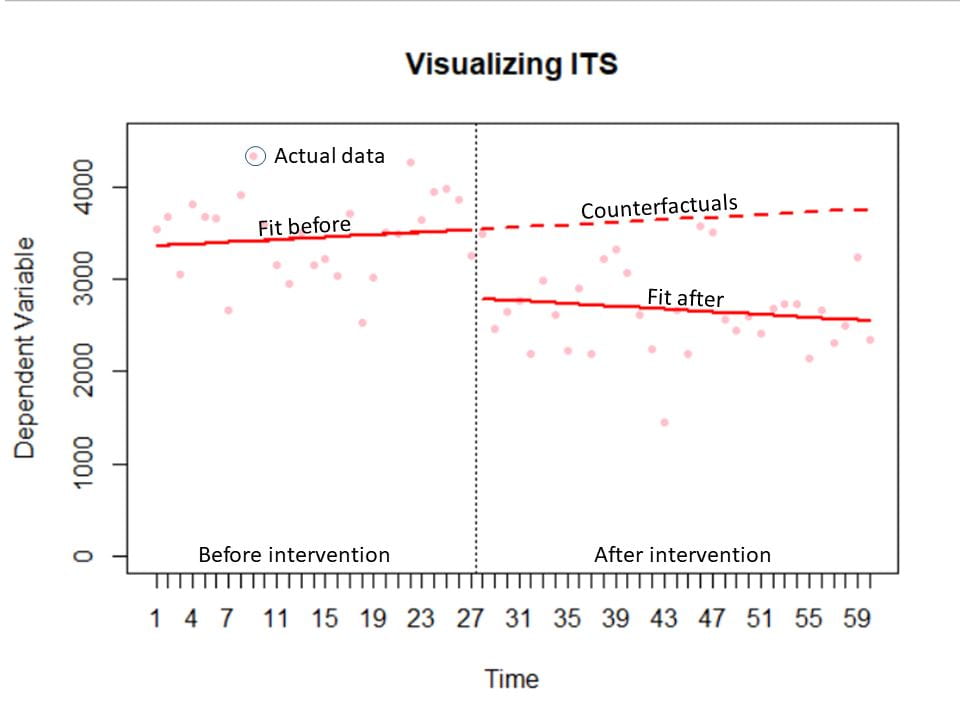
The final advantage of ITS I want to emphasize are the visuals that come out of it. The figure below has the key components of an ITS chart. The actual data is plotted in faint red. There are separate fitted lines (which give the slope and intercept) before and after the intervention in solid red. The time of intervention is marked with a dotted vertical black line. And finally, in dotted red are the counterfactuals. These are the predictions of what would have happened without the intervention. The process of fitting these lines in statistical software (such as R or SAS) provides analysis of statistical significance for free. Essentially, you get a plot that tells your story intuitively that has the byproduct of indicating whether the changes you see are statistically significant.

Visualizing the results of ITS and segmented regression.

In this brief overview, I’ve avoided the mathematics and deeper details. I hope that this discussion provides insight into when ITS might be an appropriate analysis method. Performing segmented regression does require specialized software and specialized, technical knowledge. If you have a project where ITS seems appropriate, I would suggest reaching out to a Data Scientist for a consultation on what the best option is for your particular research project.

If you want to know more, Anesthesia and Analgesia has a thorough review of the method. For technical details, I would recommend this excellent edX course.

What is a random forest?

Random forests have left the… well, forests of machine learning esoterica and become an analysis technique in nearly every scientific field. In perioperative medicine, this technique has been used to automatically predict patient mortality more accurately than ASA (Hill and colleagues, 2019), blood transfusion needs (Jalali and colleagues 2020), hemorrhage detection (Pinsky and colleagues 2020), and prolonged length of stay (Gabriel and colleagues 2019). But what is a random forest?

Decision tree

To understand the forest, we must first understand the trees. At least, that’s what my meditation app told me this morning. It was a prescient comment because random forests are indeed made up of trees.

Imagine that I asked you if a patient about to undergo surgery is at higher risk of mortality. You might ask me questions like, “What is the patient’s ASA score?” Suppose I say, “2.” Then you might ask about the surgery they’re about to have. Or you might ask me about their age. With each answer, you’re improving your prediction about mortality. And each answer might inform the next question you ask. If I said ASA 3, your second question might be different than if I say ASA 1. Mentally, you are constructing a decision tree to answer my question.

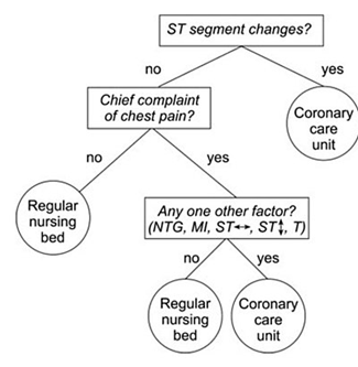
As a visual example, consider if you are trying to decide what kind of room a patient should be placed in based on information from an electrocardiogram. You might use a decision tree like the following.


Decision tree example by SilviaCalvanelli. Used with permission under the creative commons CC-BY-SA-4.0 license. This is an illustrative example only. No actionable information is communicated in this figure. It should not be used by anyone for anything.

Now that you have a conceptual understanding of a decision tree, we can return to the idea of random forests.

Random forest

Think about the mortality risk question again. Instead of just asking one clinician, what if I got twenty together in a room and asked them all this question? Obviously, things might get messy if everyone starts asking me about the patient at once. So, in this imaginary scenario, I say that everyone gets to ask one question, and each person must tell me their prediction as soon as their question has been answered. I treat each person’s prediction like a vote, and once all the votes are in, I announce the winning prediction (high risk or not).

With these 20 clinicians each asking one question and getting one vote, I’ve constructed a random forest with 20 trees, each having a maximum depth of 1. If each clinician got to ask 2 questions, then the maximum depth would be 2, and so on. If I had 100 clinicians, then the forest would have 100 trees.

The take away from this example is that a random forest is a whole bunch – potentially thousands – of very simple models that are each allowed to ask only a few questions before making a prediction. The votes from all the simple models are then tallied, and the winning prediction is announced. The technique sometimes seems comically basic, but random forests have proved to be powerful prediction tools.

Notes

The example above certainly isn’t perfect. In a more precise example, the trees wouldn’t directly know each other’s questions, but they would be told whether their answer was improving the prediction based on cases where we already know the right answer, and they would be allowed to change their questions and votes accordingly. This process is called “model training.” Also, each tree wouldn’t start from a place of expert knowledge – like clinicians would – these would be more like randomly selected non-medical folks who were given a list of potential questions to choose from.  Finally, the final prediction doesn’t have to be a majority vote. As an alternative, each participating could say how confident they are in their answer, and then the average confidence could be used to pick the winning answer.

References

Hill, B. L., Brown, R., Gabel, E., Rakocz, N., Lee, C., Cannesson, M., Baldi, P., Olde Loohuis, L., Johnson, R., Jew, B., Maoz, U., Mahajan, A., Sankararaman, S., Hofer, I., & Halperin, E. (2019). An automated machine learning-based model predicts postoperative mortality using readily-extractable preoperative electronic health record data. British Journal of Anaesthesia, 123(6), 877–886. https://doi.org/10.1016/j.bja.2019.07.030

Gabriel, R. A., Sharma, B. S., Doan, C. N., Jiang, X., Schmidt, U. H., & Vaida, F. (2019). A Predictive Model for Determining Patients Not Requiring Prolonged Hospital Length of Stay after Elective Primary Total Hip Arthroplasty. Anesthesia and Analgesia, 129(1), 43–50. https://doi.org/10.1213/ANE.0000000000003798

Pinsky, M. R., Wertz, A., Clermont, G., & Dubrawski, A. (2020). Parsimony of hemodynamic monitoring data sufficient for the detection of hemorrhage. Anesthesia and Analgesia, 130(5), 1176–1187.

Jalali, A., Lonsdale, H., Zamora, L. V., Ahumada, L., Nguyen, A. T. H., Rehman, M., Fackler, J., Stricker, P. A., & Fernandez, A. M. (2020). Machine Learning Applied to Registry Data. Anesthesia & Analgesia, Publish Ahead of Print(Xxx), 1–12. https://doi.org/10.1213/ane.0000000000004988

More p-values, more problems

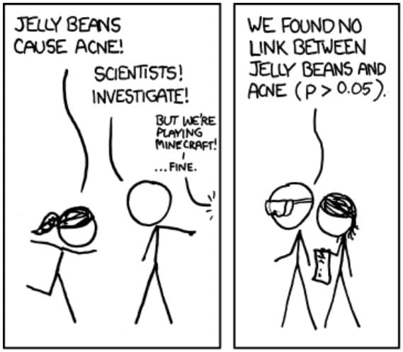
I’m a fan of the web comic XKCD by Randall Monroe, which takes esoteric math and science concepts and turns them into jokes. In one edition, Monroe tackles the issue of multiple hypothesis testing: If you test many hypothesis simultaneously without adjusting your significance cutoff (e.g., p<0.05), false positives are going to happen more than you might expect.

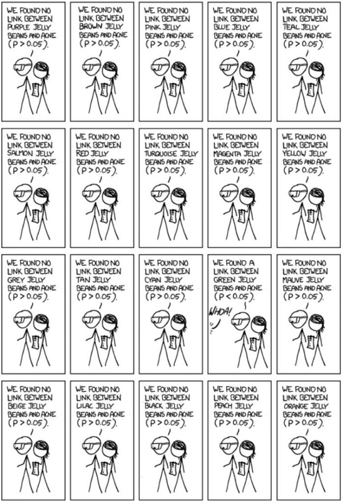
In the related edition of XKCD, two characters want to know if jelly beans cause acne. Scientists investigate this claim and find no link between jelly beans and acne. That is, the scientists test the null hypothesis, “There is no statistically significant relationship between jelly bean consumption and acne.” The results will not surprise you.

XKCD “Significant” panels. Used under creative commons license CC BY-NC 2.5.

In this joke example, the scientists test one hypothesis, calculating one p-value and comparing that one p-value to a critical value (here 0.05). No problem so far. But, what if I am concerned that one specific color out of a possible, say, 20 jelly bean colors causes acne?

XKCD “Significant” panels. Used under creative commons license CC BY-NC 2.5.

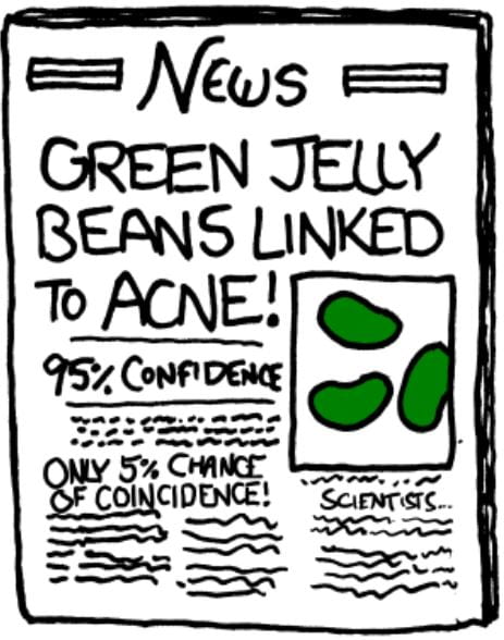
So green jelly beans cause acne? I can see the headlines now.

XKCD “Significant” panels. Used under creative commons license CC BY-NC 2.5.

Notice that part of this joke front-page news there is a comment “only 5% chance of coincidence.” Is that right? If the scientists had tested a single hypothesis, then yes. However, that’s not what happened. The scientists tested 20 hypotheses. So what are the odds this result happened by chance?

Remember that a p-value tells you the likelihood of getting a result as extreme or more extreme by chance. That means for a single hypothesis test, the p-value tell you the likelihood of getting something like your result by chance. What about if I tested 20 independent hypotheses with a cutoff of 0.05? In that case,

There is a 64% chance of at least one false positive. Said another way, it is more likely than not that this experiment will yield at least one false positive just by chance.

What do we do?

The simplest approach is to divide your cut off value by the number of simultaneous hypotheses (Miller 1981). This process is called a Bonferoni correction In this case, that would be

You may think, “That’s a very strict cutoff.” You’re right. This cutoff will do a great job of preventing false positives. In fact, we can prove it.

This number, 0.0488, can be thought of as the cut-off equivalent. If we were to somehow condense all 20 tests into 1, the cutoff for this test would be 0.488. However, as you might expect, this process results in more false negatives than would be expected from a single hypothesis test. In fact, you can prove that the false negative rate tends toward 1 as the number of tests increases (Efron 2004). That is, if you do a lot of simultaneous tests with this method, you’ll fail to reject the null hypothesis nearly every time, regardless of whether there is actually a relationship in your data.

The Bonferoni correction is still useful, though. If having even one false positive would mean disaster for your work, then the Bonferoni correction may be the way to go, as it is quite conservative. Likewise, if you are testing only a small number of hypotheses (say <25) and you expect (based on prior knowledge) that only one or two are true, the Bonferoni correction may be the way to go.

There are other options. I’ve linked to resources on a few below, but I would suggest reaching out to a Data Scientist for a consultation on what the best option is for your particular research project.

One option is to control the False Discovery Rate (FDR). For a practical guide to this process, see the section “Controlling the false discovery rate: Benjamini–Hochberg procedure” on this external blog post.  For a theoretical description, see Benjamini and Hochberg 1995.

Another option that has shown promise in Anesthesia and Analgesia literature (double meaning intended) is to re-frame your hypotheses to do joint hypothesis testing or a “gate keeping” procedure where you test a second hypothesis under the condition that the first is true (Mascha and Turan 2012).

You can also calculate Benjamini–Hochberg adjusted p-values, sometimes called q-values in some statistical software. However, these adjusted p-values lack the theoretical backing of typical p-values and methods for controlling FDR. They can be useful for quick-and-dirty analysis, but they should be avoided for publication purposes. A careful reviewer may object that such q-values lack statistical rigor. If you want to learn more about these adjusted p-values, these Berkeley lecture notes provide a succinct guide.

References

Munroe, Randall. “Significant.” XKCD. https://xkcd.com/882/.

Miller, R. (1981), Simultaneous Statistical Inference (2nd ed.), New York:
Springer-Verlag.

Efron, B. (2004). Large-scale simultaneous hypothesis testing: The choice of a null hypothesis. Journal of the American Statistical Association, 99(465), 96–104.

Mascha, E. J., & Turan, A. (2012). Joint hypothesis testing and gatekeeping procedures for studies with multiple endpoints. Anesthesia and Analgesia, 114(6), 1304–1317.5

Benjamini, Yoav, and Yosef Hochberg. “Controlling the false discovery rate: a practical and powerful approach to multiple testing.” Journal of the Royal statistical society: series B (Methodological) 57.1 (1995): 289-300.

A risk scorecard for COVID-19

A product of the UAB COVID-19 Data Science Hackathon

On June 15 and 16, I participated in the UAB COVID-19 Data Science Hackathon. My teammates and I created a scorecard model and web app that predicts the likelihood of an individual being infected with COVID-19 based on demographics, pre-existing conditions, and symptoms. We were one of three teams to win a cash prize in the competition for the novelty and success of our work.

My teammates were Thi K. Tran-Nguyen, Tarun Karthik Kumar Mamidi, and Liz Worthey (who proposed the question we focused on). Together, our skills covered the gamut of data wrangling, model development, and medical relevance. As a result, we developed a proof of concept model and web app that we envision could be used by a broad population including both patients and providers. The end result is like looking at your credit score, except that it tells you if you are at higher risk of having COVID-19.

Scorecard web app demo prepared by Tarun Mamidi.

This work may be of particular interest to perioperative medicine for both specific patient screening for COVID-19 and risk stratification methods in general.

The hackathon showcase presentations were recorded on Friday, June 19, 2020. To view the presentation for this visit, click here.