Our department (Anesthesiology and Perioperative Medicine) is constantly engaged in research and quality improvement (QI). Both pillars of the department often involve measuring the change caused by an intervention. For a large swath of such projects, a statistical test (e.g., t-test or chi-squared test) can indicate if there’s a difference between two groups of data. However, if that data has a time component, things can get more complicated.
Through this post, I hope to provide exposure to a segment of statistics called “Interrupted Time Series,” providing enough information for you to have an idea of when it might be an appropriate analysis method for your own work. I’ll avoid the mathematics and deeper details but provide enough details for you to recognize the utility and know what to search for if you’re interested in learning more.
A branch of time series analysis called “interrupted time series” (or “ITS”) helps with quantifying the effects of an intervention. Interrupted time series applies when there is a set of time-bound data before an intervention, a clear time period when an intervention occurs, and a set of time-bound data after the intervention. The core ideas of ITS come from middle school math — slopes and intercepts. ITS is a rigorous way of asking, “Did the slope change after the intervention,” “Did the intercept change after the intervention,” and “Are these changes statistically significant?” Some fields call this method “quasi-experimental study design” or “differences-in-differences”, and the particular charts I show below are all examples of segmented regression — a method within ITS.
For example, suppose some policy change is intended to reduce the rate of naloxone administrations per month. Before the intervention, we might have number per thousand of patients administered naloxone each month. Our time period of intervention would be when the policy goes into effect. After that date, we would continue to record administrations per thousand each month. To understand why such an experiment requires a special kind of analysis, let’s consider a few potential results in the figure below, where the black vertical line represents the time when the policy went into effect. Note that these plots are completely fake and are (hopefully obviously) exaggerated for effect.
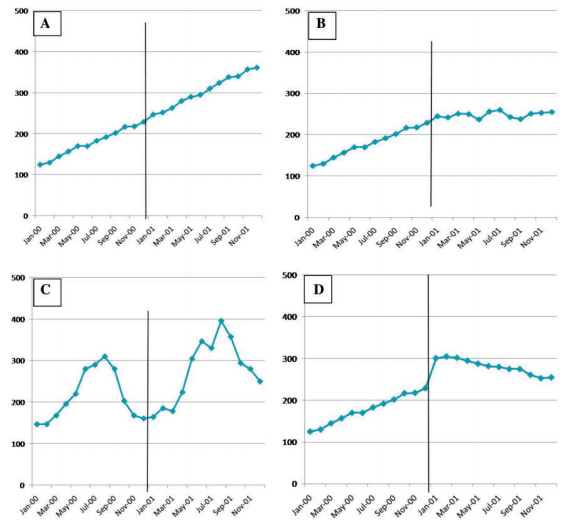
Notice with panel A, a typical two-sample statistical test might tell you that the average before and after the intervention are different. Even worse, you might conclude your intervention had the opposite effect intended, since the average after is larger than before. However, ITS would tell you that your intervention had no effect since neither the slope nor intercept of that plot changes when the policy goes into effect. On the other hand, with panel B, a two-sample statistical test might show no change with the intervention, but the slope of the line has changed, which ITS analysis would detect. In panel D, a statistical test might tell you that your intervention failed because the average increases, but ITS would also tell you that your slope is now negative, meaning that in the long-run the intervention is having the intended effect.
I skipped panel C, because it demonstrates the need for one of the more advanced techniques available for ITS. There appears to be seasonality in panel C. Luckily, as a time-series method, ITS, can explicitly address seasonality. Unfortunately, such examples do require quantitative statistical analysis and are often impossible to judge by eye.
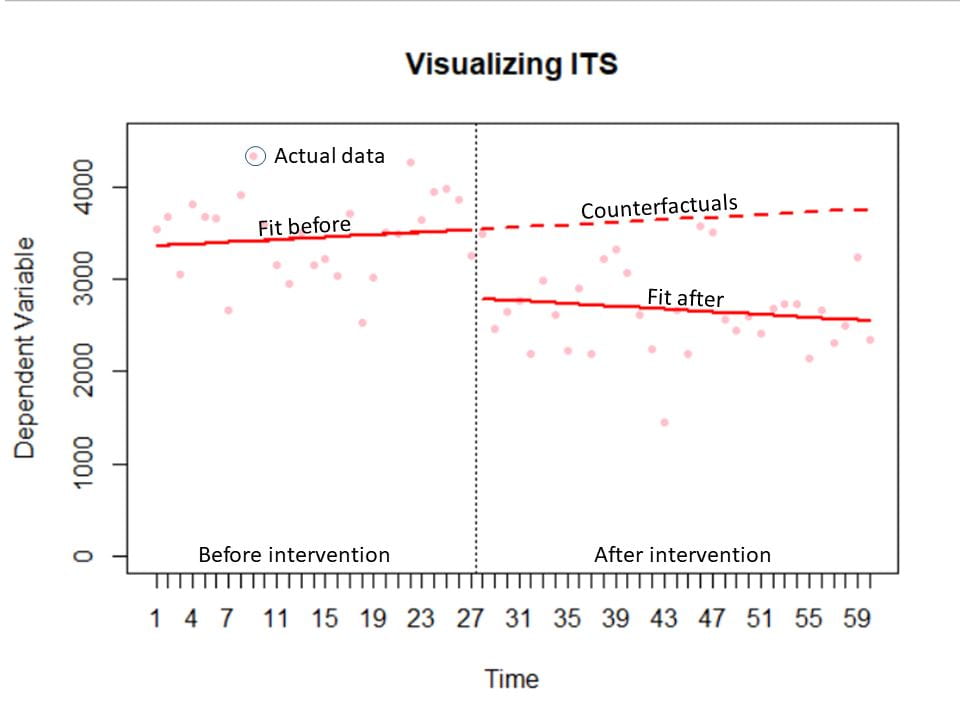
The final advantage of ITS I want to emphasize are the visuals that come out of it. The figure below has the key components of an ITS chart. The actual data is plotted in faint red. There are separate fitted lines (which give the slope and intercept) before and after the intervention in solid red. The time of intervention is marked with a dotted vertical black line. And finally, in dotted red are the counterfactuals. These are the predictions of what would have happened without the intervention. The process of fitting these lines in statistical software (such as R or SAS) provides analysis of statistical significance for free. Essentially, you get a plot that tells your story intuitively that has the byproduct of indicating whether the changes you see are statistically significant.
In this brief overview, I’ve avoided the mathematics and deeper details. I hope that this discussion provides insight into when ITS might be an appropriate analysis method. Performing segmented regression does require specialized software and specialized, technical knowledge. If you have a project where ITS seems appropriate, I would suggest reaching out to a Data Scientist for a consultation on what the best option is for your particular research project.
If you want to know more, Anesthesia and Analgesia has a thorough review of the method. For technical details, I would recommend this excellent edX course.
