Practical Applications of Data Science

A summary of Anesthesiology Grand Rounds from 2 August 2021

On August 2, 2021, I presented at Grand Rounds for our department (Anesthesiology and Perioperative Medicine). For those who missed it (and those outside the department), I’ve prepared a text summary of the presentation.

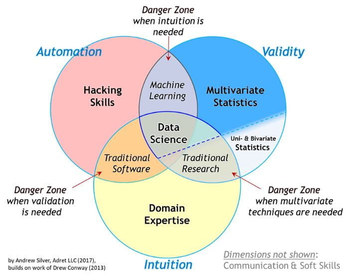
The first quarter of the presentation focused on the distinction between work that is purely in the realm of statistics compared to projects that require a data science approach. Statistics work is typically focused on detecting relationships in data and quantifying the significance of those relationships. In purely statistical work, hypotheses typically come first. In data science projects, often the reverse is true. Hypotheses are often the outcome of these projects. Data Science projects are often focused on making a prediction. After a model is developeds, hypotheses about why the model is good at making predictions (if it is) are formed and can spur future research. Data science tends to be hypothesis-generating rather than hypothesis-testing. For an expand discussion see my previous post on the topic of statistics vs machine learning specifically.

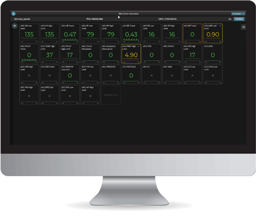
As an example of a Data Science project, I repeated a 5-minute presentation I gave at SOCCA’s (Society of Critical Care Anesthesiologists) annual meeting in May of this year. The talk itself is available on demand for those who attended SOCCA’s annual meeting in 2021. In this project, we explored whether machine learning techniques can predict incidence of allogenic blood transfusion products and identify important risk factors. This was a data science project because it started with a question (as opposed to a hypothesis), addressed a extant data set that might contain the answer, and assessed connections between patient outcomes and features after models making predictions were trained.

I summed up this section of the talk a rule of thumb: “Statistics is a hypothesis in search of data; whereas, data science is data or predictions in search of a hypothesis.”

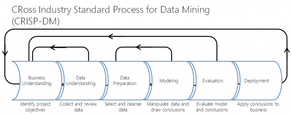
The next section focused on business understanding as the key ingredient in data science projects. Knowing the question we’re trying to answer and the business purpose or significance of it is the primary focus of data science projects. Building models (be they statistical or machine learning) is one small part of data science work. This is best visualized using the CRoss Industry Standard Process for Data Mining (CRISP-DM) project cycle (below).

Image from towardsdatascience.com

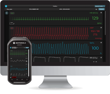
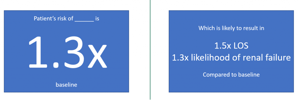
I then gave some concrete examples of outcomes of data science projects. For example, a project might result in a preoperative warning and risk assessment system (example below).

A made up illustrative example. No actual data was used, and no recommendations are being presented. This example should not be used by anyone for anything.

Next, I discussed our high-resolution, real-time data capture and analysis platform Sickbay, which I’ve posted about before. We recently submitted our first manuscript with data and analysis from the Sickbay system.

I reviewed the collaborations Data Science has brought to the department over the last year and closed the presentation with guidance on getting connected (slide below).

How to get connected to UAB Anesthesiology and Perioperative Medicine Data Science

Sample Size in Machine Learning and Artificial Intelligence

The lack of sample size determination in reports of machine learning models is a sad state of affairs. However, it also presents an opportunity. By including at least post hoc sample-size calculations in articles we submit, our Department can lead the charge for more rigorous machine learning and artificial intelligence methodologies.

If you’ve talked with me about starting a machine learning project, you’ve probably heard me quote the rule of thumb that we need at least 1,000 samples per class. I recently found out many data scientists only quote this rule when repeatedly pushed for a sample size estimate (see How Much Training Data is Required for Machine Learning? (machinelearningmastery.com)). As a result, I decided to do a literature search to see what better or newer answers to the question of sample sizes for machine learning might look like.

The problem is even bigger than I suspected! A recent review article [1] searched 167 articles related to machine learning and found only 4 attempt any kind of pre hoc sample size determination. The review also found 18 articles that attempted some kind of post hoc sample size determination.

Annoyingly, many of the pre hoc methods referenced work only for neural networks (only one of many kinds of machine learning). For example, a group from MIT determined a worst-case calculation method that ensures at least a specified fraction of images are correctly classified given a sample size N [2]. This calculation is helpful for deep learning, but it yields a prohibitively large number of samples needed for even a simple neural network (around 4,000 per class in a simple example calculation for a relatively simple network structure). Other methods borrow from statistics and essentially assume Cohen’s calculation for effect size generalizes to machine learning. For example, see this online article from Boston University School of Public Health (Power and Sample Size Determination (bu.edu)). However, this calculation neglects information about model type. Would we really expect all machine learning model types to have the exact same sample size needs? That seems unlikely.

One researcher has rigorously proved a method for calculating the probability that a model’s error rate is less than some percentage given a sample size and a theoretical property of a model called its “Vapnik–Chervonenkis dimension” [3] (also see Vapnik–Chervonenkis dimension – Wikipedia). However, this quantity is indeed theoretical and can only be bounded (setting an upper limit) for some model types. There’s no formulaic method for determining the exact quantity for a given model (at least not yet).

From the review article [1], it seems the most popular systematic approach for sample size determination is the post hoc method of fitting a learning curve. Essentially, you take increasingly large subsets of your data and calculate the error. For example, if I use 10% of my data, the error is y1. If I use 20%, the error is y2. Then you plot {y} as a function of number of observations in the subsample and fit a power law curve [1,4-5]. The resulting curve allows for inference of the needed sample size for a desired error rate.

The lack of sample size determination in reports of machine learning models is a sad state of affairs. However, it also presents an opportunity. By including at least post hoc sample-size calculations in articles, we can be leaders in the charge for more rigorous machine learning and artificial intelligence methodologies.

References

[1] Balki, I., Amirabadi, A., Levman, J., Martel, A. L., Emersic, Z., Meden, B., … & Tyrrell, P. N. (2019). Sample-size determination methodologies for machine learning in medical imaging research: a systematic review. Canadian Association of Radiologists Journal70(4), 344-353.

[2] Baum, E. B., & Haussler, D. (1989). What size net gives valid generalization?. Neural computation1(1), 151-160.

[3] Vapnik, V. (2000). The nature of statistical learning theory. Springer.

[4] Rokem, A., Wu, Y., & Lee, A. (2017). Assessment of the need for separate test set and number of medical images necessary for deep learning: a sub-sampling study. BioRxiv, 196659.

[5] Cho, J., Lee, K., Shin, E., Choy, G., & Do, S. (2015). How much data is needed to train a medical image deep learning system to achieve necessary high accuracy?. arXiv preprint arXiv:1511.06348.

A year of forming collaborations

June 1, 2021, marks my 1-year anniversary with the UAB Department of Anesthesiology and Perioperative Medicine. This last year has been one filled with new partnerships and exciting data science projects. Working here, I have formed connections across the department, hospital, campus, and other institutions (visualized in the figure below).

Network visualization of collaborations within the department (light blue), hospital and campus (green), and other institutions (gray).

Within the department, my research collaborations have focused on the development of artificial intelligence (AI) systems to reduce the cognitive load on clinicians. The bulk of these projects have been through joining research projects initiated by clinical faculty members. In these projects, Perioperative Data Science has developed AI methods that address non-hypothesis-driven questions. Some examples are

  • Predicting acute and delay kidney injuries from perioperative factors, past medical history, and biomarkers, [1]
  • Predicting blood transfusion product needs in high-risk cardiac surgery, [2-4]
  • Determining patient-specific blood pressure requirements during cardiac surgery,
  • Predicting post-PACU (post-anesthesia care unit) escalations of care,
  • Predicting outcomes of low intraoperative mean arterial pressure, and
  • Predicting bleeding risk for patients receiving heparin.

Across, UAB, I have collaborated with bioinformatics faculty, post-docs, and graduate students to develop a COVID-19 risk scorecard [5] and submit an application for an NIH grant to support building an AI to support patient nutrition initiatives. Collaborators from the UAB Department of Radiology and I recently submitted two abstracts and wrapped up a manuscript on materials for training clinicians in the appropriate use of AI tools [6-7].

With collaborators at UAB and Wake Forest, I am working on stratifying patients by risk for opioid-induced respiratory depression for enhanced monitoring. I have also initiated a multi-institution project to develop a zero-code machine learning software package that will both speed AI projects to machine learning experts and enable machine learning research for non-experts. I have also worked closely with the Sickbay(TM) from Medical Informatics Corp. development team to make sure our researchers’ needs are met by the tools Sickbay provides and assist in creating new tools when they are not. Additionally, I have initiated discussions with industry partners for sponsored research related to our clinical faculty’s work.

It has been an invigorating year of forming many connections. I look forward to even more in year 2!

[1] A. Zaky et al. (2021), “End-of-Procedure Volume Responsiveness Defined by the Passive Leg Raise Test Is Not Associated With Acute Kidney Injury After Cardiopulmonary Bypass,” J. Cardiothorac. Vasc. Anesth., vol. 35, no. 5, pp. 1299–1306, 2021, doi: 10.1053/j.jvca.2020.11.022.

[2] R.L. Melvin (presenter), D. Mladinov, L. Padilla, D.E. Berkowitz “Comparison of Supervised Machine Learning Techniques for Prediction of Blood Products Transfusion after High-Risk Cardiac Surgery,” at Society of Critical Care Anesthesiologists 2021 Annual Meeting, Virtual.

[3] R.L. Melvin (presenter), D. Mladinov, L. Padilla, D.E. Berkowitz “Comparison of Supervised Machine Learning Techniques for Prediction of Blood Products Transfusion after High-Risk Cardiac Surgery,” at International Anesthesia Research Society 2021 Annual Meeting. Virtual.

[4] R.L. Melvin (presenter), D. Mladinov, L. Padilla, D.E. Berkowitz “Comparison of Supervised Machine Learning Techniques for Prediction of Blood Products Transfusion after High-Risk Cardiac Surgery,” at Association of University Anesthesiologists 2021 Annual Meeting. Virtual.

[5] T.K. Kumar Mamidi, T.K. Tran-Nguyen, R.L. Melvin, E.A. Worthey (2021) “Development of An Individualized Risk Prediction Model for COVID-19 Using Electronic Health Record Data.” Front. Big Data 4:675882. doi: 10.3389/fdata.2021.675882

[6] A.M.A. Elkassem, A.M.A. (presenter), D. Nachand, J.D. Perchik, R. Mresh, M. Anderson, R.L. Melvin, A.D., Smith (2021) “Strengths, Weaknesses, Opportunities, and Threats (SWOT) Analysis of AI Algorithms in Abdominal Radiology,” submitted to SABI 2021. Washington, D.C.

[7] A.M.A. Elkassem, A.M.A. (presenter), D. Nachand, J.D. Perchik, R. Mresh, M. Anderson, R.L. Melvin, A.D., Smith (2021) “Strengths, Weaknesses, Opportunities, and Threats (SWOT) Analysis of AI Algorithms in Abdominal Radiology,” submitted to RSNA 2021. Chicago, IL.

Sickbay: A Brief Introduction

If you’re in the Department of Anesthesiology and Perioperative Medicine at UAB, you’ve probably heard about the high-resolution device integration, data-capture, and analysis platform called, “Sickbay.” Indeed, it is unique in its ability to chart and record, in a time synchronized fashion,  any and all  physiologic variables from our OR and critical care monitors and machines (ventilators etc.) at high frequency.  But what can you do with it?

Currently, our usage is exclusive to the Cardiovascular Operating Room (CVOR) and Neuro ICU (NICU). In the CVOR Sickbay can be used for research purposes. In the NICU, it can be used for research and remote monitoring.

As one example of research  — championed by Domagoj Mladinov and Dan Berkowitz — in the CVOR we’re currently using the platform to analyze high-resolution Near Infrared Spectroscopy (NIRS) and Arterial Blood Pressure (ABP) (at 120Hz) signals to estimate patients’ lower limits of cerebral autoregulation. That is, we want to identify the optimal blood pressure for each individual patient (precision medicine and goal-directed therapy) rather than targeting blood pressure based on commonly accepted population-based standards. Similarly, for NICU patients with Intracranial Pressure Monitoring (ICP), we can calculate optimal blood pressure from a combination of ABP and ICP signals. Both interventions would have a goal of improving brain perfusion by individualizing blood pressure (and other) therapies.

Relationship between CPP and autoregulation index PRx. When in an impaired state, there is a positive relationship between changes in Cerebral Blood Flow (CBF) and mean arterial pressure (MAP). Curves use simulated data. LLA and ULA indicate the lower and upper limits of autoregulation respectively.

In the NICU, the platform is available for remote monitoring such as Gas Monitoring (e.g., respiratory rate), ECG Signals, Hemodynamics (e.g., arterial blood pressure), Temperature, CNS Monitoring (e.g., EEG). It can also provide continuous up-to-the-minute information trends from a patient’s entire (monitored) stay.

Sickbay also has the capability to use retrospective data to create risk-calculators that can be viewed from anywhere you can access the internet.

Finally, Sickbay has a built-in process for tracking and reporting all signals for patients enrolled in a study. All you need is a list of enrolled MRNs for your IRB-approved study that can be easily imported.

If you’re a faculty member in the department and are interested in applying this technology to your clinical practice or research project, feel free to reach out to Ryan Melvin (Principal Data Scientist), to learn more about Sickbay. Additionally, if you’re a faculty member from another UAB department and want to know more about potential collaborations involving Sickbay, reach out as well.

Example of remote patient monitoring with Sickbay (TM), curtesy of Medical Informatics Corp. No actual patient data is displayed.
Example of risk calculators in Sickbay (TM), curtesy of Medical Informatics Corp. No actual patient data is displayed.

All of Us

The NIH’s massive data collection initiative All of Us allows researchers access to data from multiple institutions.

If you’ve ever envisioned a project only to find out that UAB doesn’t have sufficient numbers for the statistical power you’re after, it may be worth checking out the researcher workbench in All of Us.

While large parts of the workbench are designed with Data Scientists and Statisticians in mind, there are some key parts that don’t require knowledge of a coding language or the construction of database queries. Here I outline two of them.

The Data Browser

Even without an Alll of Us researcher account, you can search for a condition (e.g., Surgical Site Infection) or measurement (e.g., metabolic panel) and immediately be presented with the number of All of Us patient participants matching your search. For example, search for “surgical site infection” found 600 participants with a condition matching my search (see breakdown below).

Similarly, a search for “metabolic panel” found 7 matching lab measurements across about 45,000 participants.

These high level counts are available on the public portion of the website. So, you can find out if there’s a sufficient sample size to warrant applying for access to the researcher workbench and applying for IRB approvals and waivers as necessary.

One other handy tool in the Data Browser are the “matching concepts.” Here are the top 3 matching concepts that were returned in my search for “metabolic panel.”

These can be helpful when requesting data either from our internal Anesthesiology and Perioperative Medicine IT team or HSIS. You can potentially skip the part where the data person is confused about what you mean by first searching in the All of Us data browser and including the matching concepts that fit what you’re looking for. I myself have done some of this with our internal IT team, so I know it can be a time saver.

For more information on the All of Us researcher workbench, check out their publicly available description and videos: Researcher Workbench – All of Us Research Hub (researchallofus.org).

The Cohort and Dataset Builders

Sadly, I don’t feel comfortable giving screenshots here because of some of the researcher agreements that apply to All of Us. However, once you have an All of Us researcher account (and the appropriate IRB and regulatory approvals, if applicable), you can assemble a Cohort of All of US participants through the Cohort Builder and access their collected EHR data through the Data Set Builder. If you do those steps, you’ll probably be at a place where you want the help of a Data Scientist or Statistician. But, you can arrive at your first meeting with them with data in hand. Talk about speeding up a project!

i2b2

Internally, UAB has a similar initiative called “i2b2.” It can provide information about potential sample size (and statistical power) for projects you may envision. I’ll cover some of the useful bits of i2b2 in a future post. Stay tuned!

Perioperative Data Science: 2020 and beyond

Artificial intelligence and machine learning (AI/ML) are seemingly everywhere. The expansion into medicine began with radiology, expanding more recently into perioperative medicine. Between 2016 and 2020, the FDA approved 26 algorithms with perioperative utility. Last year, our department joined the charge!

Dr. Melvin is working with clinician-researchers and IT to build a Perioperative Risk Platform. This platform will synthesize massive amounts of data into actionable (personalized medicine) predictions. Our IT group’s decade-long work on a data platform makes this effort possible. Such predictive models consume data on providers, locations, times, and procedures. See the figure to the right for examples of what the resulting predictions might look.

Small, specific models will make up this larger platform. This work is underway. We are testing a model for predicting Opioid-Induced Respiratory depression using historic data. A model for ICU length of stay is undergoing refinement as part of a cross-site collaboration. This model holds promise for bed management and staffing optimization. We are implementing a model using real-time data for determining lower limit of cerebral autoregulation. Post-PACU MET call, Surgical Site Infection, kidney injury, and patient decline projects are ramping up. These and other ongoing data science projects involve collaborations from across the department.

In collaboration with Radiology, we are developing a clinician-focused vocabulary for AI. This vocabulary will speed communication and prevent misunderstanding of appropriate model use. Our hope is to be the architects of AI language for the medical field at large. We are also learning from Radiology’s inaugural AI bootcamp for residents from Q4 of 2020. Additionally, our department is planning a STAR program curriculum for machine learning.

The latter half of 2020 saw the initiation and ramping up of several data science projects. This year will see even more new projects and completion of many already underway. Check back on this blog for monthly updates.

Machine Learning or Statistics?

A Venn diagram made the internet rounds a few years ago trying to explain the overlaps of machine learning, statistics, programming, and data science. Source: https://towardsdatascience.com/the-essential-data-science-venn-diagram-35800c3bef40

Machine learning and statistics both have procedures for making predictions and exploring relationships. Trying to explain the differences in the two often feels like debating semantics. However, there are some practical differences that can often prove frustrating to those encountering them for the first time. Here I try to concretely differentiate the types of questions that each field is better at answering.

Machine learning tends to do better at predicting future values (with some notable exceptions when it comes to medical data [1]). In a practical sense, machine learning models sacrifice interpretability for predictive accuracy. For example, a machine learning model could predict what a patient’s glucose level will be a few hours from now [2], monitor for cardiac arrhythmia’s in real time [3], use a patient’s own baseline data to determine abnormal vital signs [4], recommend insulin doses [5], and so on. However, if you ask for an explanation of how the model arrived at a prediction or recommendation, a cold black box will stare back unblinkingly with no answer. Machine learning is typically best for predictions, but it tends to be bad for explaining the relationships in data.

XKCD “Machine Learning” panel. Used under creative commons license CC BY-NC 2.5.

Statistics tends to do better at detecting relationships in data and quantifying the significance of those relationships. So, if you want to show an intervention caused a significant change in patient outcomes, that’s a statistics question. If you want to know if your new score card accurately predicts sepsis, that’s a statistics question. If you want to show that a policy change resulted in different outcomes over time, that’s a statistics question. Hypothesis testing is the realm of statistics. Often these hypotheses and detected relationships imply predictions of future values (e.g., logistic regression), but statistical models prioritize interpretable relationships over predictive accuracy.

Next, let’s consider a few examples where the distinction is subtle. Suppose you’ve come up with a new index for predicting hyperglycemia. Testing whether the index performs well is a job for statistics. However, if you want to develop a new index from scratch, machine learning can help out.

Maybe you have five factors that you know lead to respiratory distress after surgery. If you want to know how much each of those factors influences the outcome, your project is best served by statistics. However, if you want the most accurate prediction of the outcome possible without needing to know the influence of each factor, that goal is in the realm of machine learning.

If you find yourself asking how multiple pieces of data relate to one another, statistics is the tool for you. However, if you are looking for predictions of an outcome and don’t need to know detailed reasons for the predictions, that’s a job for machine learning.

References

[1] Christodoulou, E., Ma, J., Collins, G. S., Steyerberg, E. W., Verbakel, J. Y., & Van Calster, B. (2019). A systematic review shows no performance benefit of machine learning over logistic regression for clinical prediction models. Journal of Clinical Epidemiology, 110, 12–22. https://doi.org/10.1016/j.jclinepi.2019.02.004

[2] Abraham, S. B., Arunachalam, S., Zhong, A., Agrawal, P., Cohen, O., & McMahon, C. M. (2019). Improved Real-World Glycemic Control With Continuous Glucose Monitoring System Predictive Alerts. Journal of Diabetes Science and Technology. https://doi.org/10.1177/1932296819859334

[3] Rajput, K. S., Wibowo, S., Hao, C., & Majmudar, M. (2019). On Arrhythmia Detection by Deep Learning and Multidimensional Representation. 2. http://arxiv.org/abs/1904.00138

[4] Stehlik, J., Schmalfuss, C., Bozkurt, B., Nativi-Nicolau, J., Wohlfahrt, P., Wegerich, S., Rose, K., Ray, R., Schofield, R., Deswal, A., Sekaric, J., Anand, S., Richards, D., Hanson, H., Pipke, M., & Pham, M. (2020). Continuous wearable monitoring analytics predict heart failure hospitalization: The link-hf multicenter study. Circulation: Heart Failure, March, 1–10. https://doi.org/10.1161/CIRCHEARTFAILURE.119.006513

[5] Nimri, R., Oron, T., Muller, I., Kraljevic, I., Alonso, M. M., Keskinen, P., Milicic, T., Oren, A., Christoforidis, A., den Brinker, M., Bozzetto, L., Bolla, A. M., Krcma, M., Rabini, R. A., Tabba, S., Smith, L., Vazeou, A., Maltoni, G., Giani, E., … Phillip, M. (2020). Adjustment of Insulin Pump Settings in Type 1 Diabetes Management: Advisor Pro Device Compared to Physicians’ Recommendations. Journal of Diabetes Science and Technology. https://doi.org/10.1177/1932296820965561

An in-progress survey of FDA-approved algorithms in perioperative medicine

I am currently working on a review of all FDA-approved Artificial Intelligence/ Machine Learning (AI/ML) algorithms in the perioperative space. The goals of this article-in-progress are to

  • assess current state of AI in perioperative medicine,
  • develop a user-friendly vocabulary for describing and categorizing algorithms, and
  • apply the developed vocabulary to FDA-approved algorithms with perioperative utility and a primary citation.

I am seeking collaborators in our department. The parts I need help with are structured, which I think makes this project a great opportunity for those early on in their research career.

Presently, I have found an online database with 70 FDA-approved algorithms that make some mention of AI/ML in either their approval or marketing materials. Of those, 26 seem to have perioperative utility, and of those 26, 17 have a primary citation I can locate.

The pieces I need help with are

  • reviewing my assessments of perioperative utility from a clinical perspective.
  • discussing the categories this paper establishes and which algorithms should go in each category.
  • Trying to find a primary citation for the 9 algorithms I could not locate.

If you are a UAB Department of Anesthesiology and Perioperative Medicine clinical faculty member and you’ve been looking for an AI/ML research project to collaborate on, please reach out to me using this form or by finding my email in Outlook.

Building the Layer Cake: A quick-value approach to AI and machine learning

For every truck in their fleet, UPS currently recalculates the best route after every single package is delivered. So, if you and your neighbor are both getting a package, in the time in takes to deliver them, UPS has determined the optimal route for all remaining packages on the truck … twice! This is a machine learning feat that required satellite launches, GPS and map experts, network theory, theories of optimization from mathematics, ten years, and hundreds of millions of dollars (see this Harvard Business School article). However, UPS didn’t start with this complex solution when they decided to optimize routes.

The following story I heard at the recent Data Science Connect (virtual) conference a few weeks ago. It contains a powerful lesson for thinking about complex projects.

As it turns out, the first thing UPS did was simply make sure that all the packages on a given, single truck were headed to the same neighborhood (or delivery area). They made a simple, common-sense change that immediately delivered value. Additionally, this change set them up for the eventual big-budget, time-consuming project.

If the packages on a single truck need to go to many different parts of a city, there is a limit to how much route optimization can improve things. It would be like asking, “what’s the best way to pay my bills by driving one penny at a time to each business I owe?” We can figure out an optimal route, but maybe there are some more basic problems to solve here first.

There is a general principle for AI or Big Data projects that we can extract from this story, and to illustrate it, let’s think about cake. I’ve taken this metaphor from Bill Franks’ (Chief Analytics Officer of the International Institute for Analytics) wonderful talk (Franks 2020 — full reference below).

Rainbow Layer Cake clipart. Free download transparent .PNG | Creazilla
Layer Cake. Image used with permission under a Creative Commons CC0 1.0 Universal Public Domain Dedication.

Consider a layer cake. When you decide to make one, you don’t go straight from having no cake to having four layers of cake (Figure above). Rather, you put down the first layer and then proceed to build on top of it with each layer setting up the conditions for the next. First, UPS had to group similar delivery area boxes onto trucks. Then, they had to figure out how to optimize the truck’s route once. Finally, they figured out how to optimize routes in real time.

Notice that each “layer” of the UPS optimization cake needed the layer before it. Deciding what delivery area packages go in what truck set up the success of optimizing routes. Then, it doesn’t make sense to try optimizing a route hundreds of times a day before you try optimizing it once. So, the single-optimization layer sets up the success of the real-time optimization layer.

Additionally, the construction of each layer provided immediate value. Grouping packages was better than not. Optimizing the routes once was better than no optimization. And finally, real-time adjustment is better than single optimization at the start of the day.

This story has informed my thinking. Now when researchers ask me about machine-learning tasks (e.g., predicting X a certain number of minutes before it happens), I think about what the simpler base layers of the cake might look like. I think about what deeper, basic questions we can answer that will provide quick value while setting us up for success on the big (whole layer cake) question.

References

Franks, Bill. (2020, October 7-9). Scaling Data Science & Analytics [Conference presentation]. DSC 2020 Conference. Virtual. https://datasciconnect.com/media/videos/

When has a significant change occurred?

Our department (Anesthesiology and Perioperative Medicine) is constantly engaged in research and quality improvement (QI). Both pillars of the department often involve measuring the change caused by an intervention. For a large swath of such projects, a statistical test (e.g., t-test or chi-squared test) can indicate if there’s a difference between two groups of data. However, if that data has a time component, things can get more complicated.

Through this post, I hope to provide exposure to a segment of statistics called “Interrupted Time Series,” providing enough information for you to have an idea of when it might be an appropriate analysis method for your own work. I’ll avoid the mathematics and deeper details but provide enough details for you to recognize the utility and know what to search for if you’re interested in learning more.

A branch of time series analysis called “interrupted time series” (or “ITS”) helps with quantifying the effects of an intervention. Interrupted time series applies when there is a set of time-bound data before an intervention, a clear time period when an intervention occurs, and a set of time-bound data after the intervention. The core ideas of ITS come from middle school math — slopes and intercepts. ITS is a rigorous way of asking, “Did the slope change after the intervention,” “Did the intercept change after the intervention,” and “Are these changes statistically significant?” Some fields call this method “quasi-experimental study design” or “differences-in-differences”, and the particular charts I show below are all examples of segmented regression — a method within ITS.

For example, suppose some policy change is intended to reduce the rate of naloxone administrations per month. Before the intervention, we might have number per thousand of patients administered naloxone each month. Our time period of intervention would be when the policy goes into effect. After that date, we would continue to record administrations per thousand each month. To understand why such an experiment requires a special kind of analysis, let’s consider a few potential results in the figure below, where the black vertical line represents the time when the policy went into effect. Note that these plots are completely fake and are (hopefully obviously) exaggerated for effect.

Figure 1 of Lagarde, Mylene. “How to do (or not to do)… Assessing the impact of a policy change with routine longitudinal data.” Health policy and planning 27.1 (2012): 76-83. These are exaggerated examples meant to indicate the need for statistical analysis in time-bound studies of policy impact.

Notice with panel A, a typical two-sample statistical test might tell you that the average before and after the intervention are different. Even worse, you might conclude your intervention had the opposite effect intended, since the average after is larger than before. However, ITS would tell you that your intervention had no effect since neither the slope nor intercept of that plot changes when the policy goes into effect. On the other hand, with panel B, a two-sample statistical test might show no change with the intervention, but the slope of the line has changed, which ITS analysis would detect. In panel D, a statistical test might tell you that your intervention failed because the average increases, but ITS would also tell you that your slope is now negative, meaning that in the long-run the intervention is having the intended effect.

I skipped panel C, because it demonstrates the need for one of the more advanced techniques available for ITS. There appears to be seasonality in panel C. Luckily, as a time-series method, ITS, can explicitly address seasonality. Unfortunately, such examples do require quantitative statistical analysis and are often impossible to judge by eye.

The final advantage of ITS I want to emphasize are the visuals that come out of it. The figure below has the key components of an ITS chart. The actual data is plotted in faint red. There are separate fitted lines (which give the slope and intercept) before and after the intervention in solid red. The time of intervention is marked with a dotted vertical black line. And finally, in dotted red are the counterfactuals. These are the predictions of what would have happened without the intervention. The process of fitting these lines in statistical software (such as R or SAS) provides analysis of statistical significance for free. Essentially, you get a plot that tells your story intuitively that has the byproduct of indicating whether the changes you see are statistically significant.

Visualizing the results of ITS and segmented regression.

In this brief overview, I’ve avoided the mathematics and deeper details. I hope that this discussion provides insight into when ITS might be an appropriate analysis method. Performing segmented regression does require specialized software and specialized, technical knowledge. If you have a project where ITS seems appropriate, I would suggest reaching out to a Data Scientist for a consultation on what the best option is for your particular research project.

If you want to know more, Anesthesia and Analgesia has a thorough review of the method. For technical details, I would recommend this excellent edX course.