It’s Free. It’s Adobe Creative Cloud.

Students working on computers, courtesy of UAB Image Gallery

By: Summer Guffey

Want to sharpen your digital literacy? Well now you can!

Adobe Creative Cloud is available to all UAB students and faculty members. The university’s agreement with Adobe allows students and faculty to create documents and edit photos for business and academic purposes. Students can hone their visual, audio, animation and organization skills digitally in the classroom. UAB believes that the teaching of digital literacy will propel students into the job market with advantages over their competitors.

Students have access to the cloud which includes a myriad of programs that can be used for design storage and photography files. Programs in the student design are:

  • Photoshop
  • Illustrator
  • Acrobat DC
  • After Effects
  • Premiere Pro
  • Dreamweaver
  • And many more!

Every student is eligible for a free Adobe Acrobat Pro license. Adobe Acrobat is accessible through your Creative Cloud license as well.

Acquiring Your Creative Cloud

Students can access Adobe Creative Cloud in five simple steps. However, if there are any issues that you run into, it is best to contact UAB’s IT department. The instructions are to be carried out as followed:

  1. Visit adobe.com, then click “sign in” in the upper left-hand corner.
  2. Click “sign in with an Enterprise ID.”
  3. Enter your BlazerID (the email including @uab.edu) and password. This will redirect you to UAB’s single sign-on page where you can log in with your BlazerID and DUO 2-factor authentication.

You will then be directed to your cloud where you can install the programs you want to use onto your laptop.

Utilizing Adobe: Tips

The difference between Acrobat Pro and Creative Cloud is important for successfully utilizing each program for your desired purpose. Acrobat Pro allows you to create and edit PDFs; this includes the addition of interactivity for PDFs. When it comes to saving documents, Adobe Acrobat is used in accordance to other offered cloud storage, such as the methods of UAB One Drive.

In contrast, Creative Cloud provides a collection of the various programs offered in design, publishing, video and image applications. You can store your designs and various photograph styles in your Creative Cloud.

For those in need of publishing applications, InDesign is useful for such projects. With this software, you can create brochures, zines, books and flyers. Graphic designers, publishers, artists and marketers all use InDesign to format their digital documents. This will be useful in professional careers that require you to develop layouts. In the professional market, InDesign is commonly used in conjunction with Photoshop and Illustrator.

Photoshop is ideal for editing photos, but can also be used to sharpen your graphic art. You can retouch your photography, combine and organize images and isolate undesired objects. Illustrator helps you create two-dimensional objects and images, such as logos, which are pertinent to most professional businesses.

The Illustrator application is also used to create vector-based designs such as your own graphics, comics and fonts. Developing the ability to work through the Adobe software will provide you with a desired set of skills which employers are looking for in the workplace.

Caret Software Review

By Jana Brown

What is Caret?

Caret is an HTML text editing software that I have been using for Dr. Bacha’s Digital Publishing EH 455 course.

Caret Logo
The Caret logo

Chosen for its simplicity and convenience; Caret made html easy to jump into. For anyone who needs to learn basic HTML, Caret is a good option. The Caret logo can be seen to the right. For Chrome users, here is a link to download Caret via the
Chrome Web Store.


Pros

A small red icon appears next to the line of code where the software detects an issue
This image shows what happens when the software detects an issue with your code

One of the biggest perks of using this software is that it is free. Thus, it is accessible for anyone with internet access.

Usability is also a major plus. I’m not the most computer savvy individual, which is why I was shocked at the ease with which I began using the software without hiccups. An important aspect that makes it so user friendly is the feature that displays a red X next to any line of code where the software detects an issue. When you hover your cursor over this icon, a tooltip appears that alerts you to the problem with your code.

Cons

The way to disable this setting is to replace the false with true on line 37
Line 37 can be found at the bottom of the image next to “disableBehaviors”

I would recommend this software to new coders. However, aspects of the software need to change in order to improve usability. I don’t like the default setting that autocompletes lines of code.

For example, when I type the opening paragraph tag, the software automatically inserts the closing tag after it. This feature shouldn’t be a default setting, and could lead to learned laziness when it comes to closing tags.

As the image above demonstrates, you can change this setting yourself in the user preferences page by changing “false” to “true” on line 37, beside the phrase disableBehaviors.

This brings me to the final issue I have with the software: Caret’s user preference page is difficult to navigate. I had to seek out online guides to help me find and fix the problem I had with the auto closing of tags.

Additionally, the online technical support guide is difficult to find when you search for it it online, and could use some streamlining. Click here for the Caret technical support guide.

Don’t Trust the Process(or)

By Chase Coats
an anxious writer
An anxious student

Let’s be honest; we all want to fit in, and for a foreign writer, sometimes that can prove to be quite a challenge.

It should come as no surprise that writing is an area where non-native speakers seem to have the most anxiety.

Entering the business world, many wish they could hide their accent or any sign that English is their secondary language, and that’s why software like Grammarly is appealing to so many!

Grammarly appeals to people who want their ideas to be heard, but don’t want to be bothered with the nitpicking that can often make or break their writing or meaning.

If you’re unfamiliar with Grammarly, it’s a program that prides itself on not just fixing minor mistakes, but improving one’s writing as a whole by interacting with the user. Grammarly highlights detected errors and offers suggestions for corrections or substitutions, but ultimately it’s up to the user to decide for themselves.

But does Grammarly allow someone still grappling with the language barrier the confidence to operate their software effectively?

What happens if what is highlighted goes beyond spelling and punctuation, and leans more towards the trickier laws of grammar or even word choice? For the non-native-speaker, a demographic that Grammarly boasts has benefitted from their services, Grammarly’s suggestions can actually muddy up the voice in one’s writing. To make matters worse, Medium.com reports that On average, Grammarly only finds 40% of errors in non-native-English.

Sinister Synonyms

The main area of concern lies in the program’s thesaurus, which attempts to improve a writer’s word choice to make their work seem more eloquent and professional. This would be one of the product’s features that a foreign voice would hope to utilize, but reviews have shown that the suggested synonyms can either be archaic or just plain weird.

An example of this questionable word choice is best seen in Writing-Skills.com’s review of Grammarly, where the word “plain” in “plain English” was the focal point. Rather than keeping the word “plain” (the software having deemed it too generic), Grammarly offered words like “basic” or “clear” as substitutions. For a foreign voice still trying to assimilate to a more Western way of speaking, these are the moments that defeat the whole purpose for using the software in the first place.

A writer must have the confidence to be able to know when Grammarly may have made a mistake, and for a non-native speaker already struggling with a transition between languages, this presents a real problem. The final verdict on Grammarly? As a product that claims to be a powerful tool for…foreign students…English language learners, and non-native-English-speaking professionals, Grammarly has the potential to fail those who truly need it most.

Random Job Experience at Random Logic Games

By William McCormick

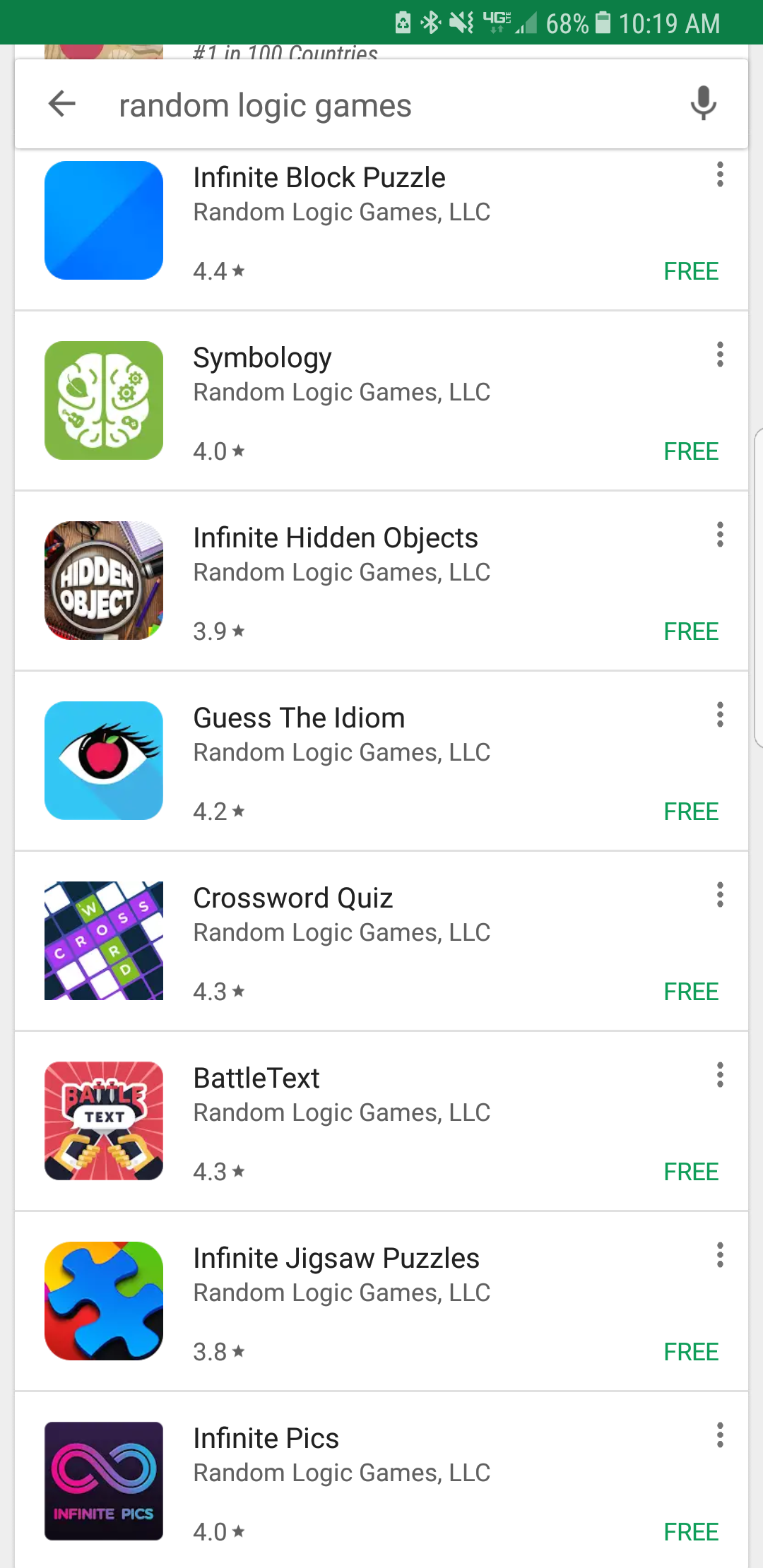
screenshot of random logic games apps
Random Logic Games apps

It is important for all college students to find an internship or job that they feel is relevant to their major. These can be important in helping someone find what they want to do with their degree post-graduation.

This is especially true for English majors, given how vague the career options for English majors can be and how varied the skills possessed by them tend to be. That is why in September of 2016, I applied for and accepted an internship with a local mobile game development company: Random Logic Games.

Random Logic Games is a game development company based in Birmingham, Alabama and founded by alumni of UAB. One of its alumni is even a former English major. Their games are, as the name implies, mostly logic and thought-based.

But why would the field of software/game development need English majors, and what could English majors really contribute to this field? At the time, reaching out to them for an internship seemed a bit odd and I did not believe I could really have a place at something even vaguely tech-related.

My main responsibility during this internship was writing up the descriptions of apps they published in the App Store or Google Play Store, and testing out the apps in question. There were also a few times when I was instructed to write and schedule posts for social media, or compile data for usage in one of the company’s apps.

This is a good example of what English majors could expect to be doing when coming into the software development field, unless they have some other form of experience that may be deemed more useful. Much of it fell into the realm of marketing, a field that many professional writers may find themselves thrust into.

This internship served as a good look into what English majors can contribute to the tech field. While they may lack the technical skills possessed by those who studied or specialize in the field, they can contribute their writing and reading skills to help those in the tech or software industries promote or improve their products. More English students should seek out these types of internships so as to get an idea of what they can do after graduation.

Turning Off The Lights

A Soft Resistance to Complicating the Process

In 2013, Microsoft released a new iteration of Word folded into their ubiquitous Office suite. Amazingly, it came with the option to pay a recurrent subscription fee for a premium license.

Even five years on, the notion of paying a subscription fee for something you could find floating somewhere in pre-installed bloatware was questionable. Not to mention the free version was relatively feature-complete for someone uninterested in much more than simple formatting or editing functionality.

If you bought a laptop with Office pre-loaded around that time, you were probably spoiled with a generous free trial from Microsoft, but you’d eventually get a prompt to re-up for continued service.

And service really is the operative word here.

At a certain point the entire business realized that as for selling software outright,
there just isn’t cash in it like there ought to be. We’re now buying services in lieu of
programs, games, or utilities because the real money is in the customer captured.

That is, the sustainer. In the subscriber.

The consumer should be a dairy cow eager to be milked, not some one and done steer ready for slaughter.

Okay, that’s a bit much, but the point is that regular (and palatably inexpensive) purchases became standard. Take a look at Apple’s highest grossing apps list. How many offer in-app or incremental purchases?

This is really all to say I can’t call myself a fan of this business model, and I know I’m not alone because the term “microtransactions” by itself is enough to raise a certain type of person’s blood pressure, but I’m burying the lede here.

What I want to address isn’t just the incremental payment model, but the resulting feature creep of software. Why do we need so many versions of Microsoft Word if not to justify the narrative that it’s not a page you put words on, it’s a whole ecosystem?

You should be signing up for another year of service, looking at banner ads next to your unfinished novel (really coming together, by the way), and boning up
on Word’s upcoming Chinese social media integration.

Thing is, this user experience is fundamentally antithetical to creative work.

Luckily, there are alternatives.

All kinds: stone tabla with stylus, dictating to a manservant, screaming your copy directly to readers, pen and paper.

Now, if you’re like me you can’t afford yet another manservant. I also like typing on computers, and the way they can save my writing as document files. So really, none of those quite get the job done.

What I do instead is use an ancient (and static) program called Darkroom, a minimalist word processor for Windows adapted from the yet more ancient Writeroom for Mac. Darkroom has features like allowing line breaks, 48 options for text color, and saving in .txt format.

It has few other features, and it’s perfect.

Darkroom Screenshot
Gaze not too long upon its glory, for neon green settings in full screen mode disturb the weak of heart and sensitive of eyes.

Well, almost perfect. Like I said, it has no other export options besides .txt, doesn’t have shortcuts for bold and italicize, and I have not been able to discern what the middle two buttons in that upper right column actually do (seriously, let me know if you find out).

Also, if you rely heavily on spellcheck, well, this probably isn’t for you, albeit if you’re like me you find autocorrect more frustrating than helpful and that’s mercifully absent as well.

In any case, I’d highly recommend checking out minimal software like Darkroom. I saw a noticeable uptick in productivity when I started using it. It feels good to write outside the visual context of document creation for once.

There’s nothing but the words when you’re finally writing “writing” rather than a Word or Google doc.

Beginner’s Tips for Website Design

By Kristen Williams
headshot of Courtney Lassiter
Courtney Lassiter

With so much taking place online, effectively designing and marketing websites are important skills; but, acquiring those skills can be difficult.

The problem? Apart from taking a Digital Publishing course, there are millions of places to look for advice, but what advice is actually helpful?

I turned to UAB Digital Media for guidance, interviewing Courtney Lassiter, a Media Fellow. Her job involves producing creative content for the University, as well as editing and building websites.

And pursuing a career in graphic design means offering tips on design and marketing is in her wheelhouse.

Below, I’ve condensed her many helpful tips into a few practical ones:

Developing Your Layout

Courtney joked about her habit of analyzing every menu she encounters, but stressed that it’s because of the important role layout plays in any visual medium. It’s a major part of marketing.

“How you lay out the content completely changes the meaning,” she said,
“if you have something that’s poorly laid out it’s not going to convey what you want to say effectively.”

Practical Step: Start on Paper

Creating a “wireframe” sketch for your site’s layout on paper (like this example Courtney traced in Adobe Illustrator) is a great starting point.

example wireframe sketch
Wireframe sketch

Then, a program like Sketch (which she recommended), can help you transition those ideas into your website. “Sketch is cool because it allows you to see the differences between various screen sizes, like desktop, tablets and phones,” Courtney said.

However, Sketch is only compatible with Mac and does charge you yearly,
so you might want to check out some alternatives depending on your budget.

For designing visual content for your site, Canva offers helpful design templates, works on Windows and Mac, and has a free option.

Using Links Effectively

With this tip, Courtney discussed that when linking to other sites you never want to send your audience away completely. That is: you don’t want your audience to leave your site for another within the same tab. Courtney explained that if you link to another site like this “[your audience is] going go there, and they’re going to stay there, and they’ll never come back.”

Practical Step: New Windows

screenshot of new tab
Direct your links to open in a new tab

Instead of leaving your site for another, have links open in a new tab.
She stated, “that way they’ll have to at least come back and exit out of [your site].
Always make them come back to you.”

Be Mindful of Accessibility

This, she claimed, is “the most important part of designing a website.” Courtney said: “if you have a glass hamburger, it’s nice to look at, but you can’t eat it.” That’s a similar problem for a website that’s visually appealing, but lacks accessibility.

Practical Step: Assess Your Content

According to Courtney, some ways to check your website’s accessibility are: assess who it might be alienating, ensure content is functional and, again, examine the layout.

Resources

Additional helpful resources she mentioned were:

Her parting advice: “It’s never going to be perfect.” However, following these tips can put a beginner on track to generating a high-quality website.

Career Spotlight: Online Content Editor

By Kalyn Wells

XML Coding
XML coding

With everything becoming more web-based, it is no surprise that there are more careers evolving around this medium in publishing today.

For example, online content editors spend most of their day creating content for the web. In addition to working with and adding content on the web, they must code their content with HTML and XML codes to properly publish it on the Internet. They strategically plan how the website should be laid out based on research and statistics of previous approaches the company has put forth on their website. So, getting to know the company and the company’s online history is a crucial part of this type of career.

Similar to most publishing careers, communication, research and proofreading are all skills an online content editor should acquire. An employer looking to hire an online content editor would look for these skills in a potential employee, but they would also look for a person who has developed coding and computer skills in order to successfully publish text and images onto the company’s website.

Creative Pool is a helpful site that gives more information about what online content editors do, what kind of environment they work in and more.

UAB offers courses in the Professional Writing curriculum that will help a student succeed in this type of career. There are courses such as Developing Digital Documents in which a student will learn more about Adobe software and how to construct a publication. Digital Publishing is another helpful course in which learning how to code for websites is one of the important objectives of the course.

You can find more Professional Writing course offerings in the UAB Catalog. A student could also take additional courses from the Communication Studies curriculum to help them gain more knowledge on the history of media.

Technology Corner

Google Drive is a free resource for most compatible Microsoft documents. Drive allows Google account holders to connect with each other through collaborative document sharing. Drive also gives users the ability to save their work on a cloud that is always accessible through internet access.

To create a Google Drive account:

  1. Go to Google Drive. You will be sent to a page that asks for your e-mail and password.
  2. If you do not already have a Google account, you will select “Create an account,” and fill out all of the required information. Once you are finished, select “Next step” to complete your account creation.

Creating a file on Google Drive:

  1. Select “Create.”
  2. Select file type from the options: Document (Word), Presentation (PowerPoint), Spreadsheet (Excel), Form, Drawing.
  3. A new tab will open with a blank file.

Sharing files with other Google Drive users:

  1. Right-click on the file you would like to share.
  2. Once you scroll down to the “Share” option, another “Share” will show up.
  3. Select the second “Share.” A box titled “Sharing settings” will show up.
  4. At the bottom of the box is an option allowing you to “Invite people.”
  5. Type your classmates’/collegues’ email addresses in the “Invite People” section.
  6. If you would like the people you share this file with to have the power to edit it, select “Can edit.”
  7. If you want them to just have to power to comment on the file, select “Can comment.”
  8. If you only want them to be able to look at the file, select “Can view.”
  9. Select “Share and save” to finish the process.

Uploading files to Google Drive:

  1. Select the upward facing arrow to the top left of the screen beside “Create.”
  2. The options “File” and “Folder” will show up (“File” allows you to upload a single file and“Folder allows you to upload a folder of files).
  3. If you are uploading a file, select “File.” a. Select whichever file you want to upload, then select “Open.”
  4. If you are uploading a folder, select “Folder.” a. Select whichever folder you would like to upload and select “Ok.”